Why 20X20 booths are the perfect space
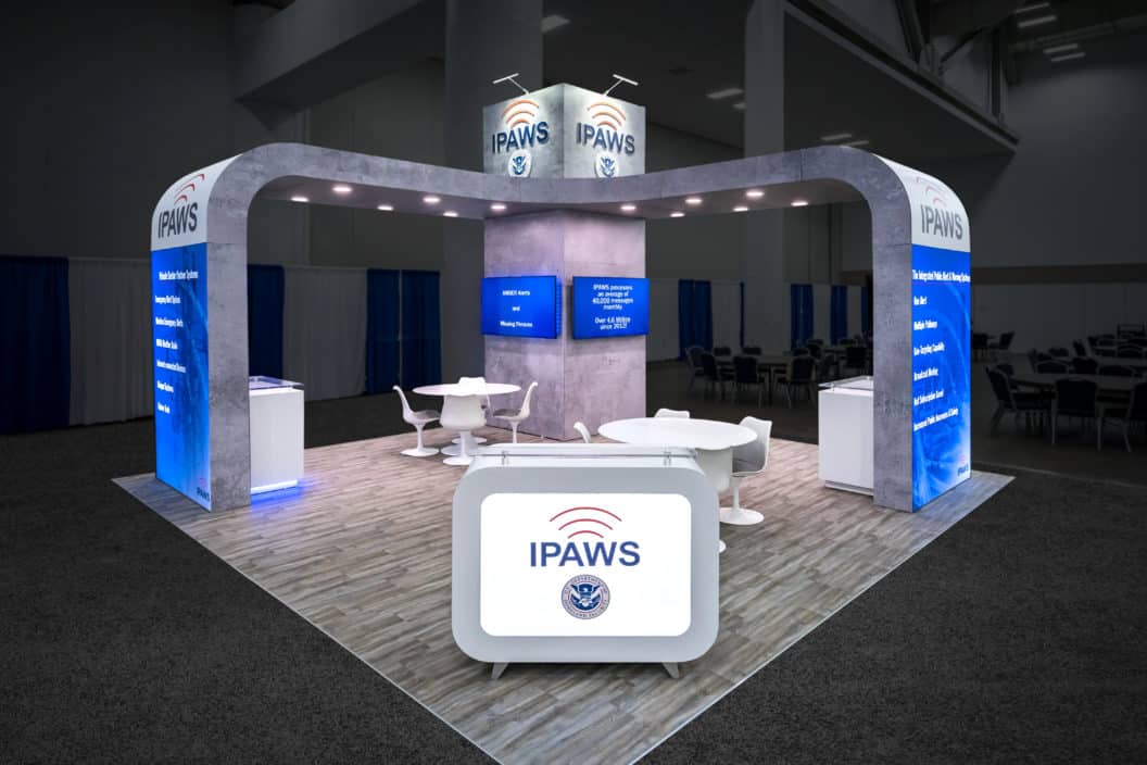
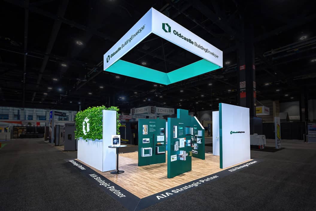
There are at least three strong reasons why 20×20 booths are the best spot at the show, regardless of the location in the exhibit hall.
Sure, it’s a bit more expensive to reserve than your traditional 10×10 or inline… but the benefits it yields for your business at the show are hard to ignore.
Just consider…
1. Island spaces give you 360 degrees of visibility
Not having to border two other exhibits and a backdrop has significant benefits when it comes to attendees finding your company on the show floor. They can enter your exhibit from any side! Plus, you have the option of maximizing your space with a hanging sign.
2. 20×20 booths have fewer regulations, giving you greater design freedom
Want to add custom elements to your exhibit? No problem! You don’t have to worry about show management moving your banner stands or tall counters for blocking neighboring exhibits.
3. Your clients can engage with the personality of your business
Let’s face it. In a 10×10 the sole attraction is the booth staff. Not knocking booth staff, but your company is larger than any single representative.
A bigger booth really gives prospects confidence that you’re an authority in your industry. They get to see your brand express itself.
In some ways, upgrading to a 20×20 booth space is like upgrading from buying a $2,500 used car to a $5,000 used car. Both the quality and reliability increases dramatically.

6 tips for building an impactful 20×20 booth space
Alright, now the congratulations are over. Now that you’ve got a premium spot, now what? You’ve got to make it look good.
But making your booth look good for the sake of looking good does your company NO good. You need content on your graphics and signs that effectively communicates WHO you are, WHAT you do and what you do BEST.
Take these six tips to heart as you begin visualizing how you want to attract the right kind of attention at your next show.
1. Make a plan: Before you start designing your booth, it’s important to have a clear idea of your objectives. What do you want to achieve with your trade show exhibit? Who is your target audience? What kind of message do you want to communicate? Once you have a good understanding of your goals, you can start planning your design.
2. Keep it simple: When it comes to trade show exhibits, less is often more. You don’t want to overcrowd your space with too much information or too many products. Instead, focus on creating a clean and simple design that will be easy for visitors to navigate.
3. Use visuals: A picture is worth a thousand words, so make sure to use plenty of visuals in your exhibit design. Use large photos and graphics to grab attention and convey your message clearly.

4. Be interactive: Visitors to trade show exhibits are looking for an interactive experience. Create opportunities for visitors to engage with your brand by offering games, contests, or free samples.
5. Stand out: With so many exhibitors competing for attention, it’s important to make sure your booth stands out from the crowd. Use eye-catching colors and unique elements in your design
6. Plan for storage: Make sure you have plenty of storage space so that you can keep your materials organized and tidy. This will help you stay organized during the hectic trade show days.
It’s important to have a clear focus for your booth so that visitors know what they should be looking at.
By following these tips, you can design an impactful 20×20 trade show booth that will help you attract attention and boost sales.
Start your design journey here.

The Trade Group is a full-service trade show and event marketing company. We will work with you to create an exhibit or an event that brings in leads and helps you achieve your business goals. Contact us here or give us a call at (800) 343-2005.


