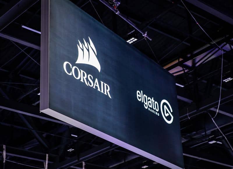
Mark Twain once said the difference between the right word and the almost right word is the difference between a lightning bug and a lightning strike. The same can be true of the humble trade show hanging sign.
Did you know many authors do not write the titles of their books or articles? That’s because editors are experts on their readership while authors are experts on their subject. In other words, editors know what will catch the attention of their audience and authors know what will challenge them.
The point is you could easily spend just as much time designing what your hanging sign should look like and say as your custom booth. That’s why we’ve written out some general principles and examples to inspire your creative brain.
First things first. When does it make sense to use a hanging sign?
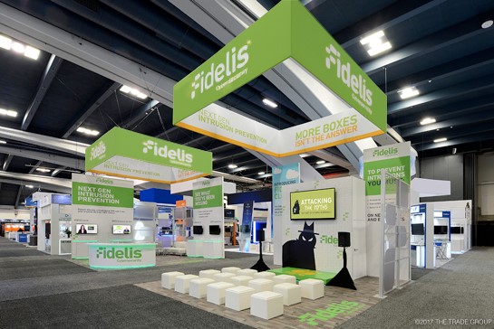
Generally, hanging signs don’t enter the conversation unless an exhibitor is in a 20×20 or larger booth space. Hanging signs are rarely used in 10×20 and almost never for 10x10s. The space is too small and there are too many restrictions.
The 20×20 spaces are sometimes referred to as “islands.” This is because they do not border another exhibit but stand alone in the open. Hanging signs for this kind of booth space is an effective way to be seen from across the exhibit hall.
Another reason exhibitors invest in hanging signs is to take advantage of the empty space above their exhibit. The space you rent at a trade show includes the air above your exhibit. A bigger space doesn’t automatically guarantee lots of traffic at a show—the space must be used effectively.

So then, what should a hanging sign say? Pay attention to these three things.
Let’s clear the air and ask a different question. What can a hanging sign say? The answer is… just about anything. Hanging signs come in a large variety of shapes and sizes.
For example, there are squares, rectangular, rotating, backlit and even signs within signs. The only thing limiting what you can do with a hanging sign is your imagination.
However, just because you can do something doesn’t mean you should. Efficient marketing is saying the most with the least amount of materials and space. Try using these three principles when brainstorming your next hanging sign.
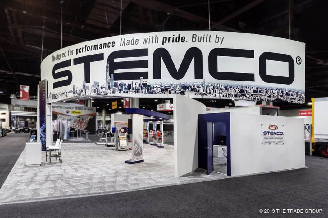
#1 A trade show hanging sign should have your company name and brand colors
I know, I know. Seems obvious. But there are a few more factors to consider. For example, say a parent company that owns several brands, do you fit all the names and logos on one side? How do you divide the space?
Another factor to consider is how much space the company name takes on the hanging sign. Did you know that margins in books and magazines are designed not for writing in but to give the eyes rest? Be sure to get multiple opinions on how easy on the eyes the logo and name is on the banner.
Little details like this make or break the effectiveness of a hanging sign.

#2 Make the shape of the hanging sign consistent with the rest of the exhibit
A hanging sign can be made in the shape of your logo like this one from the videogame streaming service, Twitch. Their hanging sign is in the shape of the chat logo. The reason why this is so killer is because it shows the service the business offers instantly.
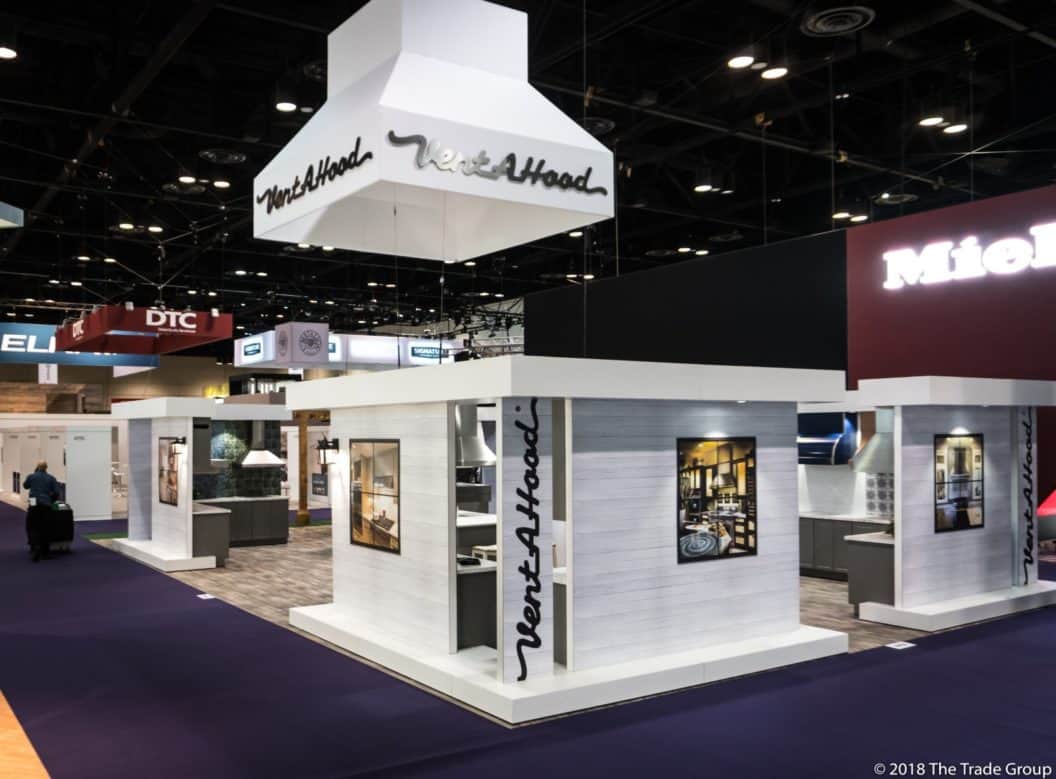
The Vent-A-Hood sign below does a killer job of highlighting the company and what they do best: building Vents! We’ve seen cloud-based software companies do similar things with hanging signs in the shape of clouds.
These are examples of efficient marketing because it reaches out and grabs prospects interested in your kinds of products or services. Instead of a visitor asking what you do, they already have some idea and can decide faster whether they want your business or not.
#3 Try a clever image or custom feature that communicates what your business does
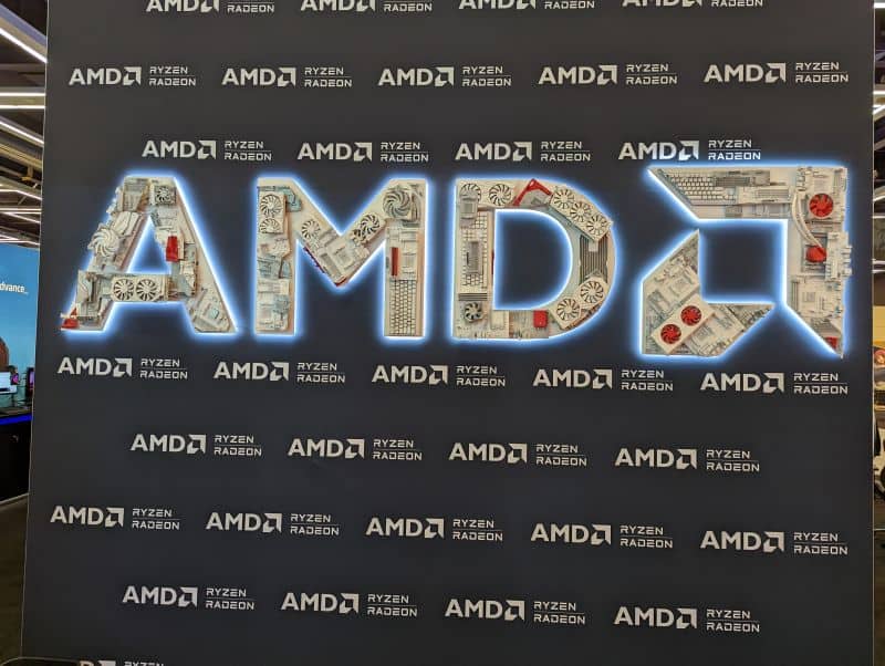
Never underestimate the power of a simple, custom feature for a booth. Sometimes one, small unique idea is all that’s needed to motivate attendees to stop by your booth. A recent example of this is AMD at PAX West.
While not a hanging sign, their sign exemplifies the principle. Advanced Micro Devices (AMD) manufactures computer processors that improve video game graphics, among other things. To communicate this, they used old computer hardware parts for their logo.
Read about the results of their booth at PAX West here.
Conclusion
We hope you get some ideas for your next trade show hanging sign. If you’re in need of more ideas, think about connecting with one of our design experts by contacting us below!
The Trade Group is a full-service trade show and event marketing company. We will work with you to create an exhibit or an event that brings in leads and helps you achieve your business goals. Contact us here or give us a call at (800) 343-2005.
